Pedestrian Routing with HERE Routing API
Alberts Jekabsons — 29 April 2026
6 min read
21 November 2025

If you are building interactive maps with the HERE Maps API for JavaScript, you have probably used this classic snippet:
window.addEventListener('resize', () => map.getViewPort().resize()); This ensures your map’s viewport adjusts correctly whenever the browser window is resized. But in today’s web applications, responsive maps are essential, and without proper resize handling, your map can easily break visually:
White space may appear after resizing
Tiles can misalign or the map might not fill its container
Users may need to refresh the page to fix the layout
So, how should you handle resizing in HERE Maps?
In this article, we will explore and compare three approaches:
No resize handling
Using the window.resize event
Using ResizeObserver
For all the examples we will discuss, my CSS is formatted like this:
CSShtml,body { margin: 0; padding: 0; height: 100vh; } #mapContainer { width: auto; height: 100%; resize: both; overflow: auto; }Let us dive in and see which method works best for modern, interactive maps!
What happens if you do not add any resize handling to your HERE Maps implementation?
On initial load, the map will render and fill the viewport as expected.
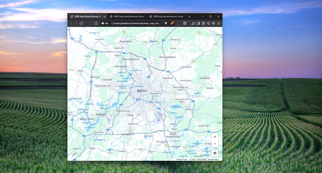
However, if the window or the map container is resized, the map will not respond to these changes. This typically results in unwanted whitespace appearing where the container has grown, and the map itself may no longer fit its designated area.
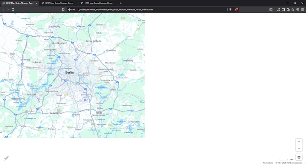
When I first started building HERE Maps with the HERE Maps API for JS, I ran into this issue later in my project. The map looked fine at first, but after resizing the browser window or adjusting the layout, it would break visually—leaving gaps or misaligned tiles. To overcome this, I eventually found guidance in one of our blog posts.
When building HERE Maps, adding a window resize handler quickly became a must-have for me. Thanks to Michael Palermo’s guidance, this simple snippet saved me countless hours troubleshooting map resizing issues:
window.addEventListener('resize', () => map.getViewPort().resize()); Why is the window.resize event needed?
The HERE Maps API uses a canvas-based rendering engine for the map.
The map is initialized with a specific size based on its container element.
If the browser window is resized—whether by changing screen size, rotating a device, or opening/closing sidebars—the map container’s dimensions may change.
What does this code do?
window.addEventListener('resize', ...) listens for any window resize events.
map.getViewPort().resize() tells the HERE Maps API for JS to recalculate the viewport size and re-render the map accordingly.
This solution works well for most examples and is especially effective for simple desktop layouts and full-window maps.
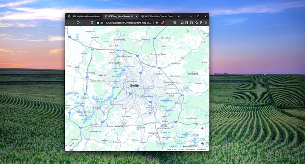
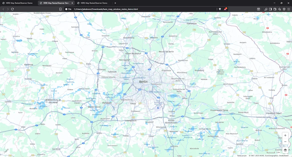
However, let us look at a more complex scenario. You may have noticed I have added resize: both; to the CSS which enables to resize the map dynamically.
While dragging the map corner does resize the map container, it does not keep the initial center of the map.
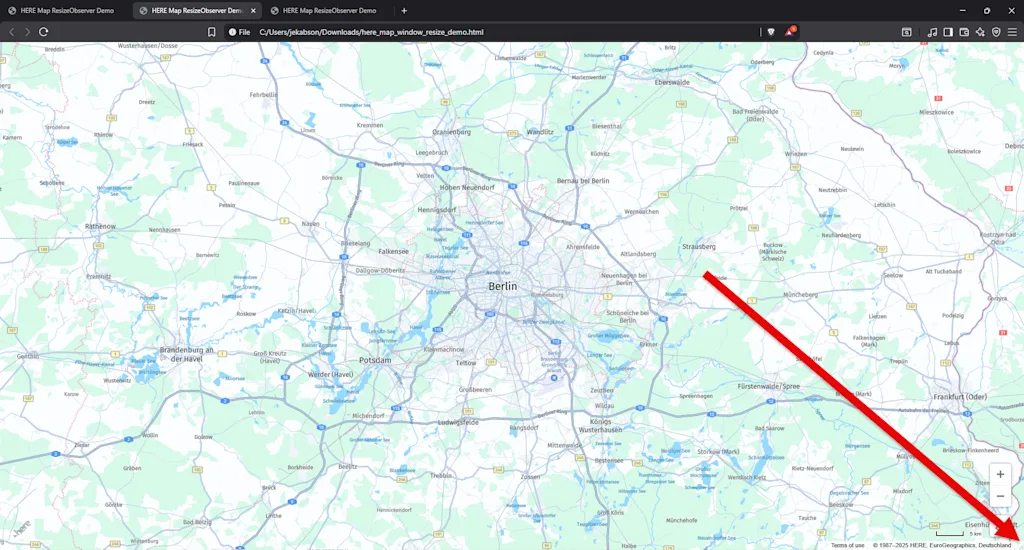
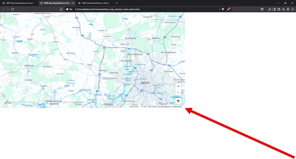
Why? Because when you use that functionality, you are resizing the #mapContainer element itself—not the browser window. The window resize listener does not “hear” these changes, so nothing happens to the map container’s size from the map’s perspective. As a result, the map does not stay centered or might not properly fill its container after such dynamic resizing.
It is 2025, and believe it or not we have a better method for dynamic resizing!
Another powerful method for dynamic resizing is the ResizeObserver API. ResizeObserver is a browser-native feature that watches specific DOM elements for size changes (MDN: ResizeObserver API). It is efficient, asynchronous, and ideal for responsive layouts, and it is surprisingly easy to set up!
JavaScript1const resizeObserver = new ResizeObserver(() => {2 map.getViewPort().resize();3 });4resizeObserver.observe(document.getElementById("mapContainer"));With this approach, ResizeObserver monitors changes to the size of your map container element. This directly solves the problem of losing the map center or having visual glitches when resizing, which can occur with the window.resize method.

Benefits of ResizeObserver:
Detects element-level changes, making it perfect for embedded maps, modals, or dynamic layouts.
More efficient and scoped than window.resize, since it only reacts to relevant container changes.
Asynchronous and less likely to cause layout thrashing.
Works seamlessly with modern UI frameworks like React, Vue, and Angular.
By using ResizeObserver, your HERE Map remains responsive and visually consistent, no matter how the container is resized.
Responsive map handling is essential for modern web applications, and the method you choose depends on your layout and requirements.
For static, full-window maps, using window.resize is often sufficient.
For dynamic, embedded, or resizable containers, ResizeObserver provides robust, responsive behavior and ensures your map always fits its container.
If you skip resize handling altogether, expect broken layouts and a poor user experience.
Want to see these approaches in action? Below is a complete code example demonstrating all the resizing options discussed.
HTML1<!DOCTYPE html>2<html>3  <head>4    <meta charset="utf-8" />5    <title>HERE Map ResizeObserver Demo</title>6    <meta name="viewport" content="width=device-width, initial-scale=1.0" />7    <script src="https://js.api.here.com/v3/3.2/mapsjs-core.js"></script>8    <script src="https://js.api.here.com/v3/3.2/mapsjs-service.js"></script>9    <script src="https://js.api.here.com/v3/3.2/mapsjs-ui.js"></script>10    <script src="https://js.api.here.com/v3/3.2/mapsjs-mapevents.js"></script>11    <script12      type="text/javascript"13      src="https://js.api.here.com/v3/3.2/mapsjs-harp.js"14    ></script>15
16    <link17      rel="stylesheet"18      type="text/css"19      href="https://js.api.here.com/v3/3.2/mapsjs-ui.css"20    />21    <style>22      html,23      body {24        margin: 0;25        padding: 0;26        height: 100vh;27      }28      #mapContainer {29        width: auto;30        height: 100%;31        resize: both;32        overflow: auto;33      }34    </style>35  </head>36  <body>37    <div id="mapContainer"></div>38    <script>39      // Initialize the platform object:40      var platform = new H.service.Platform({41        apikey: "YOUR-API-KEY",42      });43
44      // Obtain the default map types from the platform object using HARP engine45      const engineType = H.Map.EngineType["HARP"];46
47      const defaultLayers = platform.createDefaultLayers({48        engineType,49      });50      // Instantiate (and display) a map object:51      var map = new H.Map(52        document.getElementById("mapContainer"),53        defaultLayers.vector.normal.map,54        {55          engineType,56
57          zoom: 10,58          center: { lat: 52.5, lng: 13.4 },59        }60      );61
62      // Enable the event system and default interactions63      var behavior = new H.mapevents.Behavior(new H.mapevents.MapEvents(map));64
65      // Create the default UI components66      var ui = H.ui.UI.createDefault(map, defaultLayers);67
68      // To use ResizeObserver:69      const resizeObserver = new ResizeObserver(() => {70        map.getViewPort().resize();71      });72      resizeObserver.observe(document.getElementById("mapContainer"));73      // To Use window.resize:74      // window.addEventListener("resize", () => map.getViewPort().resize());75    </script>76  </body>77</html>
Alberts Jekabsons
Sr. Developer Evangelist
Share article
Why sign up:
Latest offers and discounts
Tailored content delivered weekly
Exclusive events
One click to unsubscribe