
Data Layers
Better understand the movement of people and vehicles with HERE Probe Data
Mohini Todkari — 24 August 2023
5 min read
17 October 2023

Note: This blog post contains outdated content. If you have questions please use this contact form: http://here.com/contact
Our series on HERE Probe Data analysis and visualization is designed to provide developers with a range of options for processing and visualizing data. Regardless of your preferred GIS tool, we aim to make it easy for you to get started with HERE Probe Data.
In previous blog posts, we have covered the use of ArcGIS Pro and QGIS. In this post we will walk you through the steps on how to use the highly versatile Python programming language to preprocess probe data and visualize the results.
Our dataset in this exercise includes two days of HERE Probe Data in Paris. We will first create a static plot with all 16.4 million points in our dataset, after which we will render a time lapse video showing only the high-speed probe traffic for the two-day period.
While this step is optional, it's recommended that you create a new virtual environment for the project to isolate the Python library dependencies. We will not cover how to create a virtual environment in this guide, however there are many great tutorials online that can help you if you need assistance.
The required Python libraries are geopandas, shapely, duckdb, matplotlib and datashader, moviepy, pillow. You can install them by running the following command in your terminal:
pip install geopandas shapely duckdb datashader matplotlib moviepy pillowYou can check whether the libraries have been correctly installed by running the 'pip list' command in your terminal and verifying that the output contains the libraries above.
Given the large file size of probe datasets, we will use DuckDB, a popular in-process SQL OLAP database management system for preprocessing. DuckDB comes with a native Python client API, which provides an easy way to interact with our database through Python.
In a previous blog post, we have shown how to convert probe data protobuf into csv files, which has attributes such as latitude, longitude, speed, heading, timestamp, and traceID.
Let's import the libraries we have installed in the previous step and copy the probe data into a new DuckDB database.
import geopandas as gpdimport duckdbimport datashader as dsimport pandas as pdimport globimport osfrom PIL import Image, ImageDraw, ImageFontfrom matplotlib.cm import inferno, viridis, Greysimport moviepy.editor as mpimport moviepy.video.fx.all as mpfx
# Create duckdb database establish connection and install the spatial extensionconn = duckdb.connect("ParisProbeData")conn.execute("INSTALL spatial");conn.execute("LOAD spatial;")
# Ingest all probe data csv files into the databaseconn.execute(r"""             CREATE TABLE probe_data             AS SELECT *,             FROM 'probe_dataset/*.csv';""")
# Print summary statistics of the tableprint(conn.sql("SUMMARIZE probe_data;"))The print statement's output should provide a basic overview of our dataset:
┌─────────────┬─────────────┬──────────────────────┬──────────────────────┬───────────────┬───┬────────────────────┬────────────────────┬────────────────────┬──────────┬─────────────────┐│ column_name │ column_type │ min │ max │ approx_unique │ … │ q25 │ q50 │ q75 │ count │ null_percentage ││ varchar │ varchar │ varchar │ varchar │ varchar │ │ varchar │ varchar │ varchar │ int64 │ varchar │├─────────────┼─────────────┼──────────────────────┼──────────────────────┼───────────────┼───┼────────────────────┼────────────────────┼────────────────────┼──────────┼─────────────────┤│ column0 │ BIGINT │ 0 │ 667034 │ 652568 │ … │ 81622 │ 178417 │ 314751 │ 16454620 │ 0.0% ││ heading │ DOUBLE │ 0.0 │ 359.0 │ 1200 │ … │ 83.10102004138378 │ 176.0372118490491 │ 262.46800697623644 │ 16454620 │ 0.0% ││ latitude │ DOUBLE │ 48.812255859375 │ 48.9111328 │ 7058689 │ … │ 48.83452853162131 │ 48.8603472899127 │ 48.8811803960392 │ 16454620 │ 0.0% ││ longitude │ DOUBLE │ 2.2192383 │ 2.47192363 │ 8810441 │ … │ 2.2906945866110604 │ 2.3382695703643774 │ 2.3898880023723112 │ 16454620 │ 0.0% ││ traceid │ VARCHAR │ 0008ZGZRHiQ2GOqkHXwg │ zzzuwbFQScm2ATRGz9… │ 308539 │ … │ NULL │ NULL │ NULL │ 16454620 │ 0.0% ││ sampledate │ TIMESTAMP │ 2023-03-15 00:00:00 │ 2023-03-16 23:59:59 │ 170097 │ … │ NULL │ NULL │ NULL │ 16454620 │ 0.0% ││ speed │ DOUBLE │ 0.0 │ 240.0 │ 205 │ … │ 8.935393671301886 │ 21.67506148307818 │ 39.01931355193009 │ 16454620 │ 0.0% │├─────────────┴─────────────┴──────────────────────┴──────────────────────┴───────────────┴───┴────────────────────┴────────────────────┴────────────────────┴──────────┴─────────────────┤│ 7 rows 12 columns (10 shown) │└─────────────────────────────────────────────────────────────────────────────────────────────────────────────────────────────────────────────────────────────────────────────────────────┘
Our next step is to amend the data table and prepare it for visualization.
First up, we will create a bounding box based on the minimum and maximum lat/lon values. This will be needed to define the canvas boundaries in our visualization.
We will also convert the 'speed' variable into categorical values and verify the result:
# Get bounding box of datasetdf = conn.execute("SELECT * FROM probe_data;").fetch_df()lat_min = df['latitude'].min()lat_max = df['latitude'].max()lon_min = df['longitude'].min()lon_max = df['longitude'].max()
bbox = (lon_min, lat_min, lon_max, lat_max)print(f"Bounding box: {bbox}")
# Create speed_category columnconn.execute("""             ALTER TABLE probe_data             ADD COLUMN speedcat VARCHAR;             """)
conn.execute("""             UPDATE probe_data             SET speedcat = (CASE                                WHEN speed > 50 THEN 'high_speed_above_50'                                WHEN speed BETWEEN 30 AND 50 THEN 'medium_speed_30_50'                                WHEN speed < 30 THEN 'low_speed_sub_30'                                ELSE 'unknown_speed'                                END                            );             """)
print(conn.execute(""" SELECT speedcat, COUNT(*) AS counts FROM probe_data GROUP BY speedcat;""").fetch_df())If successful, the terminal will print out our bounding box and the probe point counts per speed category:
Bounding box: (2.2192383, 48.812255859375, 2.47192363, 48.9111328)
              speedcat    counts0     low_speed_sub_30  103898831   medium_speed_30_50   33470512  high_speed_above_50   2717686
For this step we will be using Datashader, a highly optimized rendering pipeline which can handle massive datasets.
We will start by preparing the canvas size and location, using the bounding box values we computed from our data. Once our canvas is ready, we will plot our probe points by passing the data as a pandas dataframe and defining the color map.
Finally, we'll save our plot to a png image in our project folder.
# Datashader canvas preparationcvs = ds.Canvas(plot_width=1000,                plot_height=600,                x_range=[bbox[0], bbox[2]],                y_range=[bbox[1], bbox[3]]                )
# Pull the probe dataset from duckdb into a pandas dataframe df = conn.execute("SELECT column0, longitude, latitude, speedcat, sampledate FROM probe_data;").fetch_df()# plot the probe points on the canvasagg = cvs.points(df, x='longitude', y='latitude')
# Use datashader's transfer_functions to adjust the visualization parameters then save to fileimg=(ds.transfer_functions.shade(agg, cmap = viridis, how='log')).to_pil()img.save("frame.png")
If successful, your newly created probe data plot with more than 14 million points should be waiting for you in your project folder!

Feel free to experiment by tweaking the color map and other variables in the Datashader functions as you can achieve quite striking results! Here are some of our favorites:

As a final exercise, we will create a timelapse video from our dataset to understand where and at what time high speed traffic occurs in Paris.
# Filter on high speed points and resample the dataframe into thirty minute splitsdf = df[df['speedcat'] == 'high_speed_above_50']df['sampledate'] = pd.to_datetime(df['sampledate'])resampled = df.resample("30T", on='sampledate')
# Iterate over the resampler object and store the sliced dataframes in a dictionarydf_dict = {}for i, (timestamp,df) in enumerate(resampled):    df_dict[i] = df
# Loop through the sampled dataframes and create framesfor i, df in enumerate(df_dict):    df_frame = df_dict[i]    # get day value of sample    day = df_frame['sampledate'].iloc[0].day_name()    # create datashader canvas    cvs = ds.Canvas(plot_width=1000,                plot_height=600,                x_range=[bbox[0], bbox[2]],                y_range=[bbox[1], bbox[3]]                )    agg = cvs.points(df_frame, x='longitude', y='latitude')    img = (ds.transfer_functions.shade(agg, cmap = inferno, how='log')).to_pil()    # add time of day to frame image    draw = ImageDraw.Draw(img)    font = ImageFont.truetype("verdana.ttf", 24)    draw.text((10, 10), '{:d}:{:02d}'.format(df_frame['sampledate'].iloc[0].hour, df_frame['sampledate'].iloc[0].minute), 'white', font=font, min_alpha=70)	# add number of probe points to frame image	font = ImageFont.truetype("verdana.ttf", 18)    draw.text((10, 40), '# of probe points: {:,}'.format(len(df_frame.index)), 'grey', font=font, min_alpha=70)   	img.save(f"frames/frame{i}{day}.png")
# Compile individual frames into video fileimgs = glob.glob("frames/*.png")imgs = sorted(imgs, key=lambda t: os.stat(t).st_mtime)clips = [mp.ImageClip(m).set_duration(0.10) for m in imgs]concat_clip = mp.concatenate_videoclips(clips, method="compose")concat_clip.write_videofile("probe_animation.mp4", fps=60)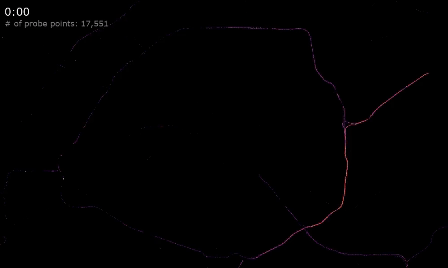
We hope this quick tutorial will be useful in getting you started with HERE's extensive Probe Data library.
Stay tuned for future updates, tutorials, and use cases showcasing HERE Probe Data. For more information about HERE Probe Data, visit the HERE Probe Data User Guide.

Akos Magdo
Software Engineer
Share article
Akos Magdo
Software Engineer
Mohini Todkari — 24 August 2023
Mohini Todkari — 05 September 2023
Mohini Todkari — 11 September 2023
Why sign up:
Latest offers and discounts
Tailored content delivered weekly
Exclusive events
One click to unsubscribe

