How we built a map showing commute times to downtown core and housing costs
HERE Technologies and Zillow partnered to analyze home value growth by commute times across 35 US metropolitan areas. The map of the analysis shows home values within a short commute of these job centers have gone down compared to those located farther out. Typically, the more distant homes are more affordable.
User experience and UI
Choose from the 35 featured cities to see how the median home value has changed over the past 10 years. In addition, you can switch to see the two-year change in home value displayed in percentage. Switching between these two values reveals insight into how the housing market has changed, both in the aftermath of the financial crisis as well as the more recent pandemic.
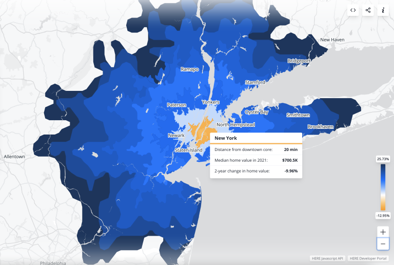
The area within an isoline is displayed in a color that corresponds to either the median value or two-year change in value for all properties within that entire area, irrespective of direction. For the home value, lighter blue signifies areas with lower value homes, and darker blue signifies areas with higher value homes.
For the two-year change in home value, the areas are colored in different shades of orange and blue, depending on whether the value decreased or increased over the specified time period. A darker orange indicates a larger decrease in home value, whereas darker blue indicates a larger increase in home value. The lighter the shade of both colors, the closer the percentage change is to zero.
A chart shows the distribution of median values or change in value by distance from a metro’s downtown center, in 10 minute increments. Once a year is selected, you can use the arrow keys to move forward or backwards across years. A custom tooltip shows up when you hover over a specific isoline area on the map, displaying a summary of both home value and two-year change in home value for that specific area.
Embedding the map
This map can be easily embedded in articles and customised using URL query parameters. Use the embed button in the upper right corner of the map to get the iframe code and embed the map with your current view settings. The parameters specify which city you want to focus on, whether you want to show home values or two-year change in home values and which year you want to start with. There is also an embed parameter that determines whether the map is shown in the embed mode (without title and embed buttons) when the value is set to true, or in the default mode (whole UI) when the value is set to false.
Data and products used
For this map, Zillow identified the zip codes that function as the 35 largest US job centers based on data from the US Census Bureau and data on the number of inbound trips per square mile provided by HERE Technologies. The centroids of these zip codes were treated as destinations for commute times to determine which geographic areas fell under a corresponding time band, created using the HERE Isoline Routing API. These isolines show all the destinations that can be reached with a vehicle within a certain amount of time running from 10 to 90 minutes from the downtown core.
We also used the HERE Javascript API to render the map. The basemap uses a custom gray scale to emphasize the overlaid blue and orange isolines and their contained areas. Explore the map here.
Have your say
Sign up for our newsletter
Why sign up:
- Latest offers and discounts
- Tailored content delivered weekly
- Exclusive events
- One click to unsubscribe